Sunday 27 April 2014

Edward Hopper was is an early 20th century printmaker and painter who made prints of urban life of early 20th century New York.  I admire him for his style of illustration.  I like how he could depict scenes from everyday urban American life just through the use of line, through hatching and cross hatching.  Here're a couple of his prints from 1920s New York.


When I tried to create the image of the dog with the guitar, I realised very quickly that time was a problem.  Maybe if I thought of it earlier I could do it!  Here's some of the prints I did but I can't use them in the presentation.


For the presentation I will present the prints in this way.  Since dogs by their very nature are loyal to their owner most of the time, the dog in the middle represents loyalty.  In this case, it's my loyalty to music and and to always keep it up during my life.  Here's the presentation, except without the pen dog under the lithograph dog.  


Monday 7 April 2014

I was messing around a bit in my sketchbook and I was playing with the idea of presenting my prints in a way that it looked like my dog was playing the guitar.  I chose to do this because the dogs loyalty to it's owner could be a metaphor for my loyalty to guitar and music.  When I say loyalty towards music, I mean keeping it up because I can see myself playing guitar and listening to music until the day I die.

This is a basic template of what the finished 3x3 box could look like.


This is just a spur of the moment idea I had.  I'm not sure yet if I'll use it.  We'll see!

Sunday 6 April 2014

Mary Collett is a Bristol printmaker who inspired me to make a print of my dog.  She loves creating images of birds and other wild animals such as elephants, wolves, dogs and so on.  Mary originally qualified as a junior school teacher, specialising in art but she's had other careers since then such as a computer programmer, a technical consultant and a company director.  Here's some of her prints.


After 2 weeks of Collography, we started Lithography while keeping the same project topic.  I very much prefer lithography because I'm free to draw a lot more than I am in collography.  After hitting a dead end with the music approach and thought about who I am as a person.  Then I thought of my pets and I'm very much a dog person.

I worked off a picture I took of my dog at home and decided to do my first Lithograph of her.


I changed the image around a bit on Adobe Photoshop CS6 to make it easier to draw from.
I then did one practice run in pen in my sketch book before I drew her onto the stone.


After 2 hours, I finished the picture on the stone and began to print.  I found drawing in crayon hard because I never use it.  In this case, I had to because the ink has to stick to the grease for the image to come out.  So far, this is the only image I've done because there's a lot of preparation for lithography like grinding down the stone (which took forever after this!), remembering the various steps to printing the image and so on.


This was my first attempt.  Overall, I did 12 of these to get the right one.  I wanted the image to be like the photograph, as black as possible and in Lithography, the more prints done, the darker the image.


This is the final draft.
I hope to do a different image before the week is out.

Someone who inspired me to take the music approach to the project is an Irish artist called Louise Carey who is entirely self taught and started her career designing album covers for various bands.  This combined with her love for music ultimately led to her becoming a successful graphic designer.  Here's some of her work.


I wasn't sure where to start on my project so I was interested to see how other people used music to make art.  Louise Carey was one of them.
For the first 2 weeks of printmaking, I was introduced to Collography.  I found myself printing various materials like plastic bottles, cardboard cups, string and many other materials I never thought I'd be printing.  The pre-conceived idea I had in my head of only doing etchings and wood block prints quickly vanished.  

Our project is on "Identity" and "Place", whatever we think of this is up to us.  I chose to focus on my own identity and who I am as a person.  The first thing I thought of was music as I have been playing guitar for the last 6 years.  I love it and I play it every spare moment I get so I started with that.

Here are some of the successful collographs I did based on my guitars and my Ipod.


Most of what I did, I cut into the card to give it almost a lino cut effect.  The top image is the iconic Ipod wheel.  I did many of these but this is one example.  

Here are the plates I made and inked up to make these prints.


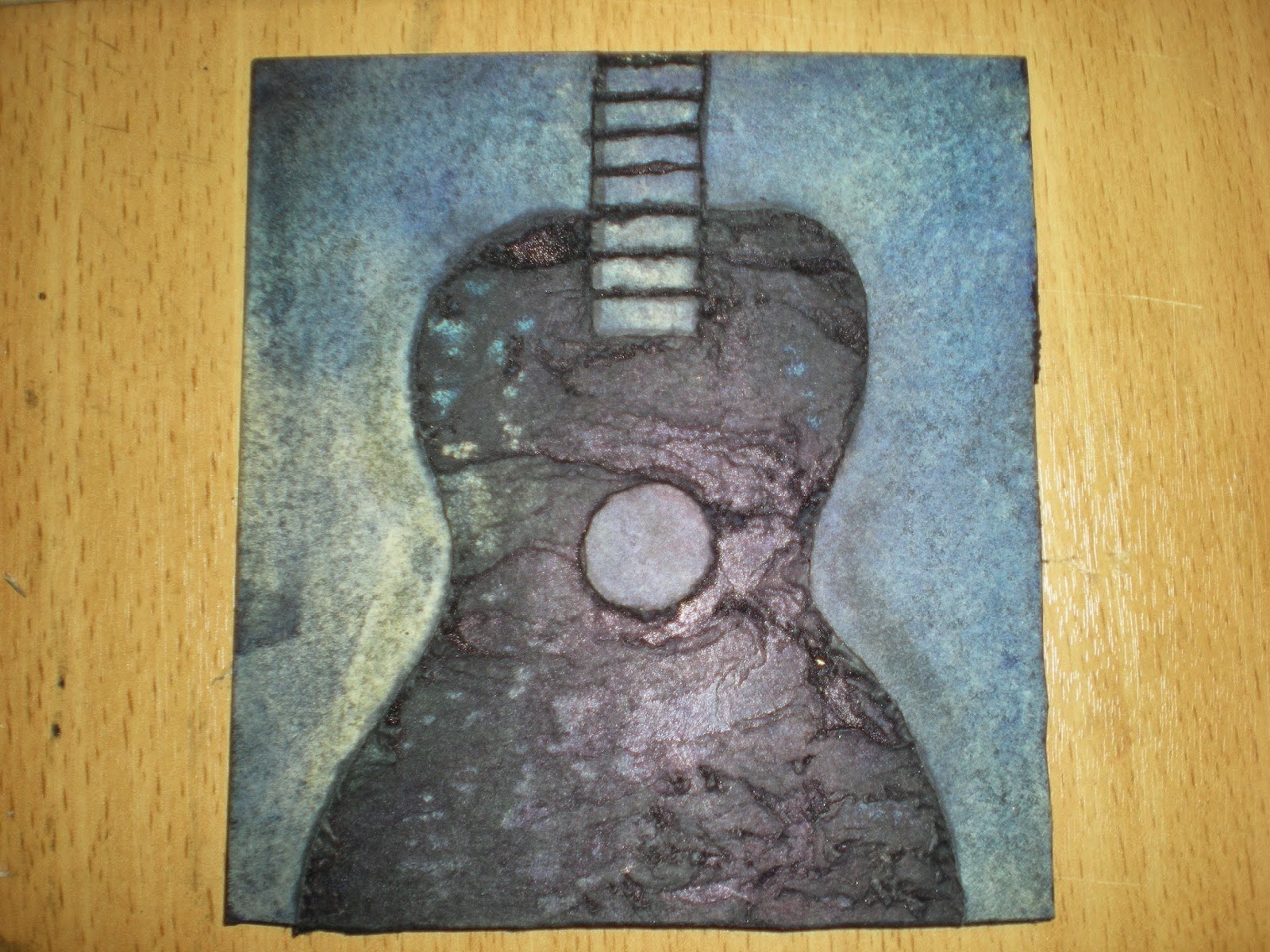
This is an unsuccessful collagraph plate that I made.  It was supposed to be a close up of the neck of a guitar with the frets made out of watercolour paper.  This was supposed to act like a stencil but backfired horrendously!


The resulting print came out almost completely black and I threw it away straight after.  It only occurred to me later on that I could have put it on the blog!


These are some other prints I did.  These weren't overly successful.  The top one also came out quite messy as it's full of my fingerprints!