Monday 11 January 2016

Earlier on in the year, I went on a college trip to Venice for a week.  While I was over there I went to the Biennale they were holding which was basically two full days of looking at art.  It was great and in this Biennale, I came across one of my favourite artists so far!  His name is Moosa Al Halyan and he's based in Dubai.  His subject matter is based on drawing different kinds of horses in order to evoke emotion from the viewer.  His subject matter has little to do with my own however I love his drawing style!  It's intricate, detailed and looks stunning!  I want to mention him as I will be taking inspiration from him as time goes on.  His style is similar to what I aspire to be like in the future.

Here's a picture I took of one of his pieces while I was over there.


These are better (found them on google!)


Sunday 10 January 2016

I found Jean Jullien's and David Shrigley's websites a great tool to fall back on when my creativity tank was running out!  I've explained why these two artists have been a big inspiration to me already so here's the link to their websites.


Here's Jean Jullien's online portfolio too.  I found it to be both helpful and entertaining!


The link below is also an interview of Jean Jullien about the Paris peace symbol that he did.  He talks about how it was a reaction to the attacks on Paris and completely unplanned.  Its a very powerful image and I use this way of working on occasion.  Jean Jullien showed me that everything I do doesn't need piles of research or has to be very deep and meaningful.  My etchings are very direct about what I'm talking about and most of those images were just my reactions to how I feel on technology.


This is the part of the interview I'm talking about.

Did you sit down with this image in mind?
No, to be honest. I didn’t do any sketches. It was a reaction. The first thing that came to me was the idea of peace, that we needed peace. I was trying to look for a symbol of Paris, and obviously the Eiffel Tower was the first thing that sprang to my mind. I just connected both of them. You know, there wasn’t much work process behind that. It was more an instinctive, human reaction than an illustrator’s reaction.

Much of your work tends to hinge on visual puns and visual creativity. The simple combination of these two iconic symbols is incredibly powerful. What advantages do you think illustration has over the written word in conveying information at times like this?
Images are universal. Let me put it this way: In my opinion, the strongest images are the ones that don’t require any deep background in culture or art history to decipher. It needs to be instinctive. It needs to be something that people from different backgrounds can recognize automatically, and it’s this notion of identification more than reading. You understand before you decipher the image, and I think with words, sometimes, the barrier is higher. Images existed before words, and they do convey a sense of universality.

I mentioned earlier about Vince Low's drawing approach to scribbles which inspired the scribble drawing of Gollum a while back.  I simply applied his philosophy of drawing to an already existing subject matter which is the comment on people's dependency on technology.


This link brings you to the first interview I read with Katie Scott.  She has a great quote in here which I'll apply to most of my work in the future.

"I particularly enjoyed drawing from imagination rather than reference, which is probably what lead me down the style of work I do now".


For the automatic drawing piece I did, even though I got that drawing approach from Sigmund Freud, my favourite person who draws from imagination alone is Illustrator Katie Scott.  Her images have inspired me to draw without any visual reference, which is something I'm very new to at this stage.  Her subject matter doesn't apply to my work as its mainly botanic style drawings, however its the drawing approach (drawing from imagination) I got from her.  Her imagery is stunning and I hope to reach this level of technical brilliance someday as well as keep up the naive, child like drawing style as well.  Here's some of her work.


When I was doing the woodcuts, I wanted to improve my technical skill and convey my message as clearly and effectively.  I came across an African American graphic artist/sculptor called Elizabeth Catlett.  She's one of my favourite woodcut artists and like me, she's dealing with issues of her time.  In her case, it's the African American experience of the 20th century.  Her level of skill regarding woodcuts is remarkable and I looked at her work in order to improve my own visual imagery.  Her subject matter doesn't apply to what I'm doing.  Here's some of her work.


Tuesday 5 January 2016

This year I finally got the chance to try out the digital printer!  I'm sure it'll get easier the more I do it but for the moment I hate it!  It was very hard to use, there's like a million different steps and a million more different types of paper!!  I ran into countless difficulties trying to work the thing which included things like corrupted files, wrong type of paper selected, colours running out of the printer etc.  Overall it took like 3 hours but I finally got there in the end!! YAAAAAAAAAAY!!!!!!

Here's the print.


Here's how it looks on my wall.  It came from one of my other drawings from the start of the semester.  Here's how it looks on my wall in my studio!


I scanned in one of my drawings, re-sized it and put colours on it in photoshop.  I robbed this way of working by Jean Jullien and I want to do it more often in the next semester as I want to be comfortable with using the digital printer.
I got the opportunity to try out "Photolithography" a while back.  Instead of using a photograph however I did a simple drawing on assotate with a light sensitive marker.  The idea was to keep it transparent so the light would go through it in the light box.  I'm glad I got to try it and it's another print process under my belt!  Here's the Photolithograph.


I thought it turned out ok for something I didn't expect to work in the first place!  The idea behind the drawing was that people are obsessed with keeping a record of where they've been on social media without really appreciating the moment itself.  If we've a picture of the view on our Tablet, why bother looking at the view in the first place right?

I expanded on this idea a little more by making a woodcut from my imagination.  I'm getting out of the need to always have reference material as I enjoy the spontaneous nature of drawing from my imagination.

Here's the woodcut.


This one took two days aswell!  I've a habit of making things harder for myself than they have to be!
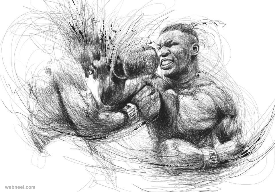
While I was researching Sigmund Freud's ideas on humour I rediscovered his automatic writing technique and I remembered learning last year how Surrealist artists adopted this idea to drawing.  At this stage I was getting weary of the basic drawings, sketches, etchings and I wanted to do something that would keep me occupied for a while.  It didn't have anything to do with the idea I was going with but I wanted a break from my concept without having to stop working.

So over two days I shut away all reference material, blanked my mind and started drawing with nothing in mind.  I wanted to let the drawing evolve into whatever it happened to turn into and to be honest I surprised myself!

Here's the result.


It's A3 sized and the photos below are just close ups.


It was fun to do!  I'd never tried automatic drawing before and I didn't use a lot of colour this semester, so it was a nice change from the naive childish cartoon doodles i was doing so much of!
I realised I never put up the pen drawing! Here it is!


It doesn't look like it here but when you look at it up close you'll see that I drew this out of scribbles.  
I got this idea from an artist called Vince Low who creates these amazing scribble portraits that I love!
I was quite fond of the Gollum metaphor and I wanted to take it a step further so I got an idea from contemporary artist Richard Prince to draw on top of the pictures that I used for drawing reference.  This is the picture from Prince.


Here it looks like he took a photograph of some kind of tribes person and put collage and marker on top of it for humorous effect.  I wanted to do something similar with the Gollum photocopies.


I think these are more effective than the pen drawing and the etching I did a while ago.  They're simplistic yet they convey the message I want to put out there.