The Tweet box design I did last year became the idea for my new 3rd year self directed brief. Here's the brief I set for myself.
Conny O’Connor –
K00185158
3rd Year
Printmaking
Self Directed Brief
My self directed brief is based on the concept that the
young generation of today are almost completely dependent on technology. Our youth have become addicted to social
networking. Most people up to the age of
around twenty five just can’t be without their Iphones or Tablets or Ipads
these days. It’s so easy now to check
Facebook, Twitter, Snapchat, Tinder, Instagram and multiple other social
media. Not so long ago you’d have to
wait until you were at a computer to check the internet, now it’s as easy as checking
the time on your phone.
As well as this, very few young people will send letters
anymore. Talking to somebody in America
or Australia from Ireland now is as easy as talking to your friend down the
road from you. All it takes is a message
on Facebook. Faxes are from the last
generation also. I’d be surprised if
anyone under sixteen years old knew what a fax was, or a Walkman, or a
VCR. Technology has completely taken
over, thus making all these things of the past obsolete. Now a smart phone can carry out the functions
of all these things and much more combined!
Technology to me seems like a drug these days. Everybody wants, everybody needs it. Kids around eleven or twelve used to start
off with a simple phone to keep contact with their parents and friends. Then a phone with a camera came out, then a
built in Ipod, then the internet etc.
Before long everybody needed access to facebook all the time and the
whole generation got hooked. It’s like a
simple phone was the gateway drug to fancier technology. Now all it really takes to get a young person
to spend an outrageous amount of money on a new phone is to put a higher number
in the title (IPhone 4, IPhone 5, IPhone 6 etc).
To top off this entertaining aspect of life, I’ve also come
to the conclusion that young people are prisoners to their phones as they’re
never free from them. They’re slaves or
mindless zombies to their phones because it’s at the point now that the person
no longer controls the phone but the phone controls the person. It’s even at the point now where technology
has introduced its own language to our way of life. Words like “yolo, lol, soz, totes v defo,
prom prom, a9 etc” are all commonplace and are as a result of constant social
networking.
I was going for a humorous/childlike approach to the project as I personally find this style of making art quite enjoyable. The 3 main artists I first started looking at were David Shrigley, Jean Jullien and Theresa McCracken. Here's some of their work and why I chose them for inspiration.
Conny O’Connor –
K00185158
3rd Year
Printmaking
Artists/Concepts to
research
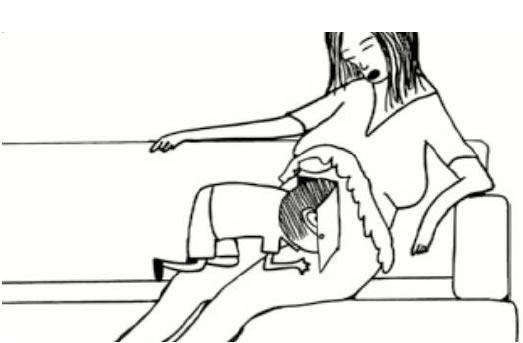
Jean Jullien
Jean Jullien
is a French graphic designer who’s currently based in London. He’s attended Quimper in Nantes, Central
Saint Martins College and the Royal College of Art in London. He works in a wide variety of media from
Illustration, Installations, Photography, Video, Costumes, Posters, Books and
even Clothing to create a large body of work.
He draws his compositions with thick markers which gives them their
cartoon like quality. I love his work
because it frees me from the anxiety of needing to spend hours drawing very
detailed images. I enjoy the simplicity
and entertaining aspects of his work and I can relate to his sense of humour
quite well. I also enjoy the subject
matter of his work and how he mocks it through his images.
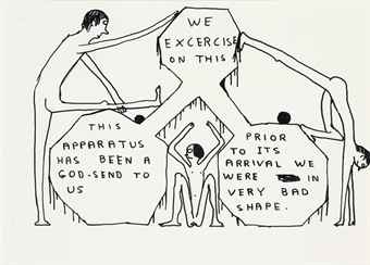
David Shrigley
David
Shrigley is a visual artist who’s best known for his bizarre, crude and
immensely entertaining drawings. He
received a BFA in Glasgow School of Art in 1991 but claims that he’s an
outsider in the artworld. He has
exhibited widely and has done solo shows all over the place including San
Francisco, Glasgow and Copenhagen.
Although he recently started encorporating film into his practice, he
mostly just puts pen and pencil to paper and draws whatever is going on in his
head or the world around him. David
Shrigley is my hero and I really love his child like approach to art. I’m a huge fan of the humour he implies and
the way he draws with crossed out words, uneven lines, no perspective or
attention to detail. Usually in the
artworld this would look like criticism but not in this context.
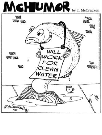
Theresa McCracken
Theresa
McCracken is a great inspiration to me.
She’s a cartoonist with a unique sense of humour who apparently lives
with a few stray animals outside of Waldport, Oregon, USA. She’s also a naturalist, historian and writer
but is most well known for her simple yet effective cartoons. She’s done illustrations for many magazines
and newspapers including The New Yorker and The Saturday Evening Post. Theresa aims her work at a wide audience as
it’s for everyone to enjoy. She mainly
draws her cartoons with pen or pencil.
I’m a huge fan of her work. I
love her simplistic drawing style, just lines, no shading or much detail at
all. It showed me that a drawing doesn’t
need to look photo realistic to draw attention and love her approach to adding
humour to her work.
Here are the processes I hope to use
Image making
Strategies/Print Processes
·
Start off with sketches of ideas in my
sketchbook
·
Make all of them into etchings
·
Start using big, thick black markers and make
drawings into screen prints
·
Do larger scale drawings around my studio space
·
Maybe incorporate photography into my practice
(Photograph models doing funny poses)
·
Do a few woodcuts of these sketches as well
Resources


No comments:
Post a Comment